This post contains affiliate links for which I receive compensation
Choosing fabrics and colors for quilts
by Victoria
(Melbourne ,Australia )
")
The 2 fabrics (they are more faded in real life )
Victoria writes...
I'm new to quilting and would love some help on fabric choices please!I've got two vintage\retro fabrics that I really want to use. One is an old (faded) printed flannel sheet and one is orange/yellow flower print cotton.
I'd love ideas on what colours would go with them and also I'm thinking about the balance of colour. I'm doing a basic square type quilt to make it easier for me.
Any advice be great!
Thanks,
Victoria
Julie replies...
Hi Victoria!Welcome to the wonderful world of quilting. You're going to have FUN!!!
In response to your question, I'm assuming:
- You want to showcase each of your focus fabrics (FF from now on in my response) in your quilt, and...
- You will use each in a different quilt


The three that I personally recommend are above. They are all older books, and are just as good as the day they were published.
The images are affiliate links. Click on them to go directly to the Amazon.com website for more information, read the reviews of others and/or to purchase any of the volumes to add to your personal quilting library.
Fabric Picking 101
It breaks down into three simple concepts: 1)Color and Value, 2)Pattern and Scale, and 3)Contrast.Value and Color
Value is simply how light or how dark one fabric is in comparison to another.To illustrate, on it's own brown is probably what you would call a 'dark' color.

But put it next to black and now, comparatively speaking, it's a medium.

The contrast between the two determines the value.
Put a darker and a lighter fabric next to each other. The lighter one seems to come forward visually. Just like a little kid jumping up and down, "Look at me! Look at me!"
In comparing colors, the warm ones—yellows, oranges, red and some purples—come forward more than cool colors—those with greens, blues and some purples. Pair a warm orange with a cool blue and the orange will invariably come forward visually.
So to highlight or emphasize either of your two focus fabrics, they should be:
- Lighter in value than the other fabrics in the quilt, and/or...
- Warmer in color than the other fabrics.
Pattern and Scale
Choose different fabric 'patterns' to go with your floral and print. If your quilt contains all floral patterns, your focus fabric gets lost.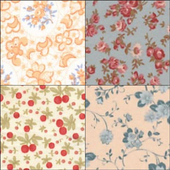
Not to mention it's pretty boring to look at.
The upper left fabric is the lightest and logically it should come forward. Because the prints are all about the same size though, it ends up getting pretty much lost. It certainly doesn't stand out the way as the 'star' of the bunch.
Solids, geometrics or other patterns with a different scale (size) of pattern contrast with the design of your FF. The differences in value and color help to complement your fabric and make for a more interesting quilt.
Choosing coordinating colors
This is scary to a lot of quilters, but if you can dress yourself to go out...you absolutely can choose fabrics for a quilt. I am certain you can do it!Find fabrics that 'work with' your FF. If you have just a few additional fabrics, and this is one of your first quilts, then I suggest selections that closely match the colors in the FF. You will feel more confident in the process at this early stage of your quilting. Confidence is huge in growing as a quilter.
In the future, when you work on quilts with dozens of fabrics, you can move away from 'matchy-matchy' for more interesting results. (The Jinny Beyer book above does a good job describing this.)
When you're at the quilt store...
...pull a bunch of fabrics. More than you think you need.You don't have to buy them all. But you really do need to have them next to each other to evaluate how they look as a whole. How well they play together.
Once you've finalized your choices, I urge you to play a bit longer.
Remove the brightest one. Is the pile better or worse for its removal?
Remove the darkest one...same question. Play with what you've got.
Step a ways away from the pile. Does one fabric JUMP out at you? If it's not your FF, you may want to consider replacing it with another. It's grabbing the attention away from where you want it to go.
Trust your own eyes. They'll tell you what is pleasing to you every time. (And what is pleasing to you, may not be to another...that's perfectly OK...it's not their quilt!)
Boiling it down...
Choose fabrics that play together nicely, ones that don't pull attention away from the FF.Vary the size and type of patterning in your fabric choices. This is a form of contrast.
Most quilts are better when they contain at least one each of a light, a medium and a dark fabric. Remember that contrast is comparative (as shown above), not absolute.
Think about it, if all your fabrics were close in color and close in pattern, would any of your piecing work be seen by the viewer?
It seems to me that if you're going to all the work to piece a quilt, you want people to know you pieced it. Why hide your endeavors?
On the other hand, if that type of muted look is truly what you're after, then go for it!
Again, it's your quilt. Let it be your vision.
Have fun with the process.
I hope this has helped.
Readers, please share your thoughts on how you choose fabrics for your own quilts. Just use the 'comments' link below!
Thank you!
Piecefully,
Julie Baird
Editor
PS Click here for an example of pulling fabrics for a scrappy quilt based on a focus fabric.


Nifty Notions


By Julie Baird
Copyright © 2008-2024 Generation Quilt Patterns, LLC
All Rights Reserved
Generations-quilt-patterns.com does not sell any personal information. (See Privacy Policy)